theTITLE AGENCY · Title & escrow · 2026
theTITLE AGENCY
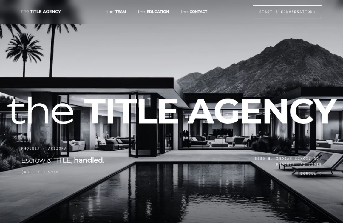
A bold, monochrome, industry differentiating identity for TITLE & escrow.
454
Active users
Source: Google Analytics snapshot, Oct 2025 – Sep 2026
398
First-time visitors
Source: Google Analytics snapshot, Oct 2025 – Sep 2026
158
Visits from Google search
Source: Google Analytics snapshot, Oct 2025 – Sep 2026
383
Meet the Team page views (7.4% bounce)
Source: Google Analytics snapshot, Oct 2025 – Sep 2026
85
Education Center views
Source: Google Analytics snapshot, Oct 2025 – Sep 2026
14
Live buyer & seller checklists
Source: Site content at launch
The challenge
The Title Agency needed one clear, consistent presence across print, social, and the web for a Phoenix title and escrow team.
What we made
Build a system. A monochrome palette, a circular TA combination mark, and typography-led layouts. Carry it everywhere. The same system runs through the brochure, social creative, merchandise, and the website. Teach, don't just sell. The website's Education Center gives buyers, sellers, agents, and lenders guides and checklists for every step.
- Brand Identity
- Website Design
- Brochure Design
- Social Creative
TITLE & ESCROW·PHOENIX, ARIZONA
TITLE AGENCY
A brand in
black & white.
A connected visual identity, from the first impression to the next step.
01 / VISUAL SYSTEM
CONTRAST. FORM. HIERARCHY.One identity.
Many ways to show up.
The combination mark, a monochrome palette and a clear typographic hierarchy form a consistent visual language.

CURRENT WEBSITE TYPE SYSTEM
SELECTED LIVE WEBSITE COLORS & TYPOGRAPHYOCTOBER 2026
02 / PRINT
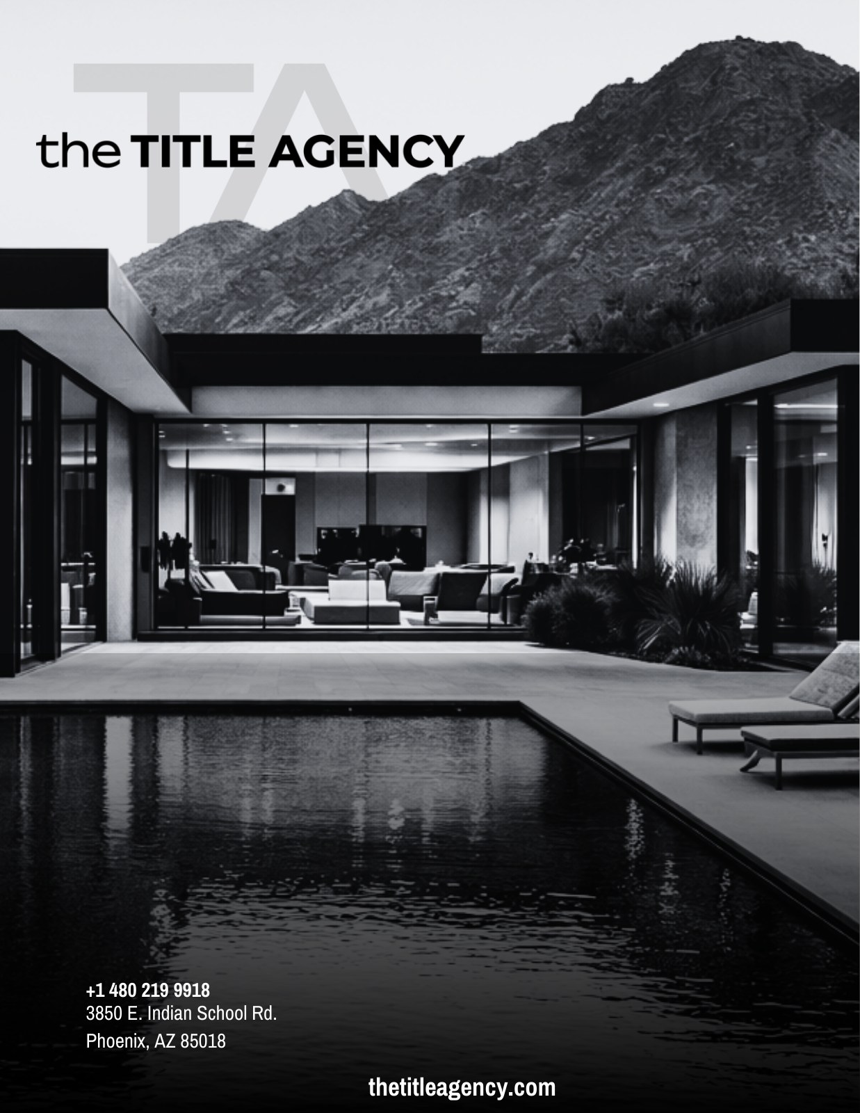
SEPTEMBER 2026 BROCHUREPrint, with
presence.
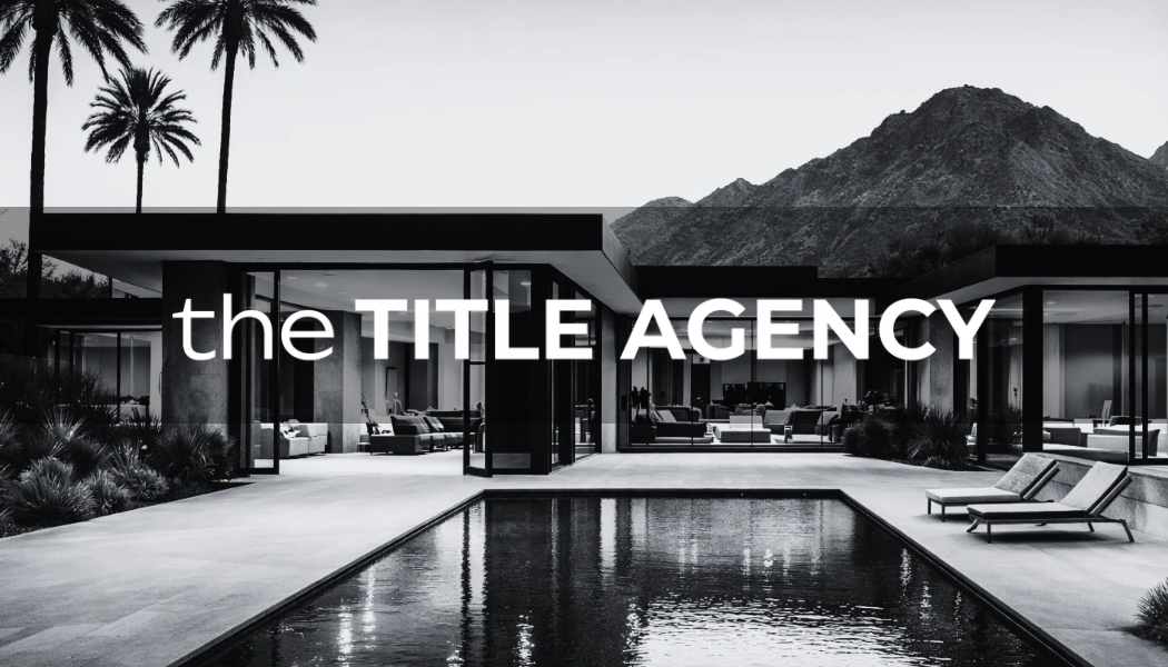
Architectural imagery introduces the brand. Inside, generous space and direct typography give the services room to be read.
03 / DIGITAL
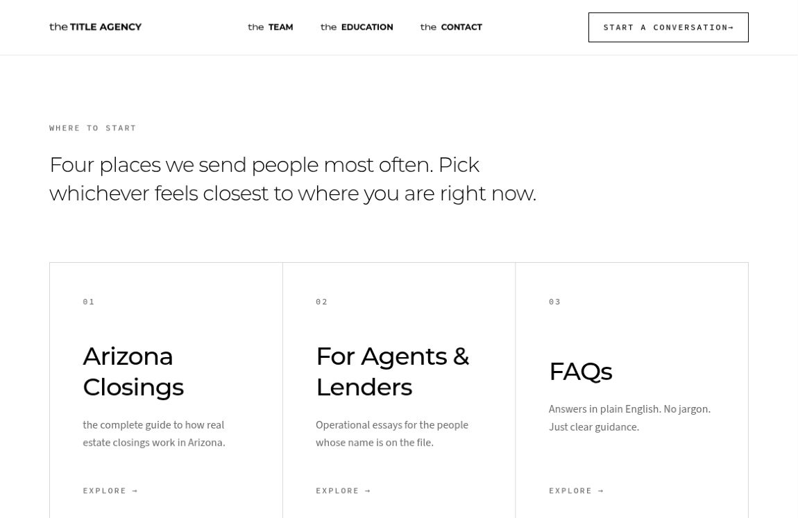
THE EDUCATION CENTERA clear path
to what’s next.
The website extends the identity into useful information, with audience-led navigation and practical closing resources.
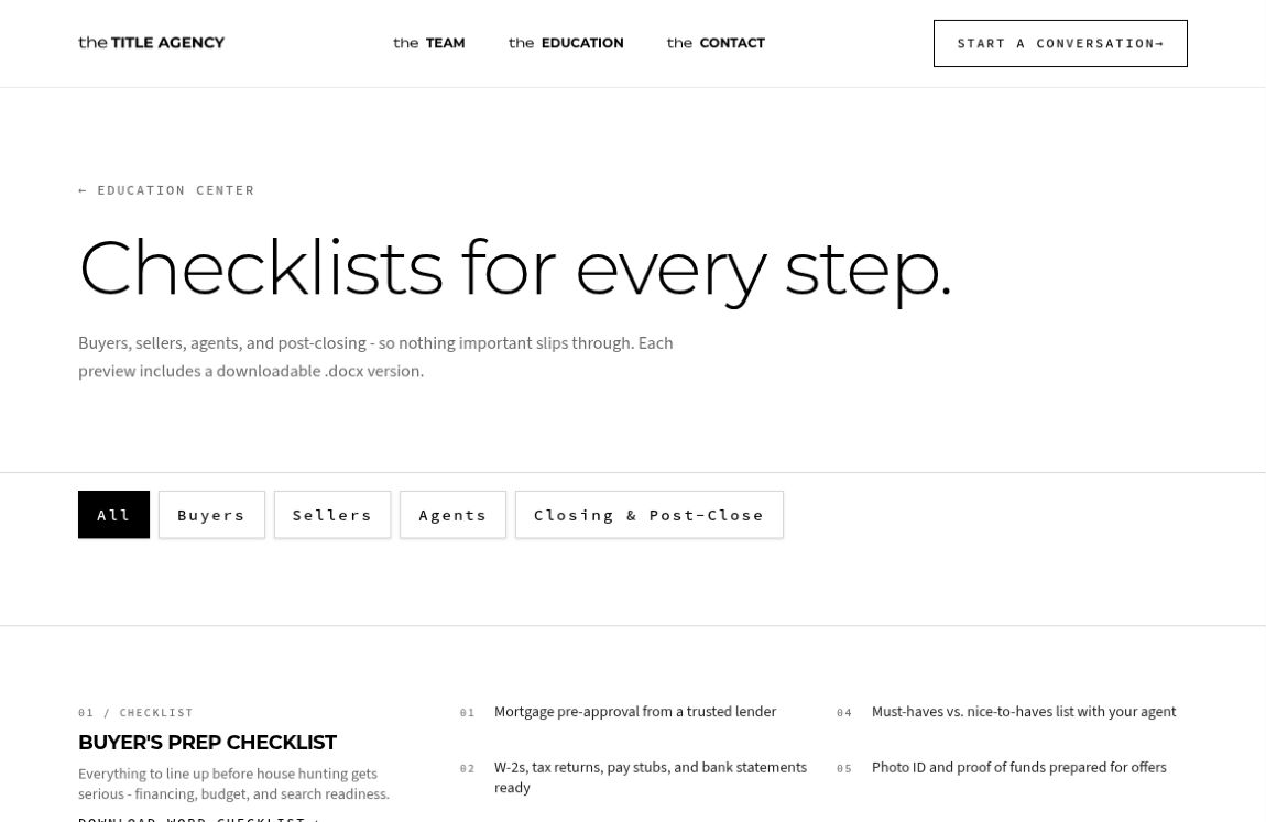
LIVE CHECKLIST
PREVIEWS
A SHARED VISUAL LANGUAGE, FROM BRAND INTRODUCTION TO EVERYDAY RESOURCES.
04 / APPLICATIONS
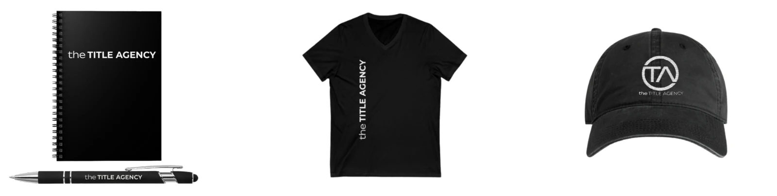
EXISTING MOCKUP CONCEPTSBeyond
the page.
A larger voice in the campaign creative. A smaller signature on everyday objects.
The identity is explored across a billboard concept and earlier merchandise mockups.

05 / EVOLUTION
A CONSISTENT THROUGHLINERefining
the expression.
The architectural imagery and monochrome identity carry through to Sandy Saro’s business card. The front introduces the brand; the back keeps contact details clear.
Two sides of one brand expression.
TITLE AGENCY
From first impression
to everyday detail.
The logo suite